One of the sessions at the Arts Festival Conference in Portland, sponsored by ZAPP, was “Public Portfolio Critique.”
A mock jury of 6 people sat at the front of four screens in a large room. One at a time, artists’ slide presentations were projected as they might be in a slide jurying situation. The jurors offered valuable feedback for each set that was projected, and I took loads of notes.
Here’s what I learned. Most of these notes are from the jurors, but I’ve thrown in some of my own observations.

You have 20 seconds to impress the jury with your slides.
The festival organizers in the room had anywhere from 500 to over 2000 applicants for their events. They can’t spend more than 20 seconds on each set of slides.
The images are as important as what is in them.
Beware of hotspots and washed out images. When the photos are projected as a group, any inconsistencies are noticeable.
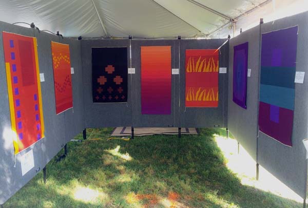
Image Details
Jurors are distracted by words. If all of your work has words in it, you’re probably okay. But rethink your submission if only one or two pieces have words.
Your signature should be blurred so that it’s not legible.
Don’t use patterned rugs or tablecloths in your booth or in the photos of your booth.
Most 3-D pieces are shot on a gray background. When slides are projected that have other colored backgrounds (such as white or black), the result was jarring for the jury. Stick with gray.
The background in all of your images should be the same.
Consistent image sizes are critical. Configure all of your images to take up the entire width or, if vertical, height of the slide. Mixing horizontal and vertical images looked less impressive.
If you make wearable art and use live models or mannequins, it’s best not to show the eyes.
Booth Shots
Include at least one of your individual works in the booth shot. This gives the jury a sense of scale. It also comforts them because they know that your booth will look like the staged photo.
You want the jury to look at the images of the individual works, then glance at the booth shot, and then return to the images.
If there is anything in the booth shot that is incongruent with the individual works, jurors begin to focus on the booth shot and try to make sense of what the artist is submitting.
Booth shots should show the entire booth.
You can’t just show one or two walls of your booth because this makes the jury wonder what’s on that third wall.
There’s a “Potters’ Problem,” which was described like this: Potters tend to want to put out everything. Their booths and booth shots need curating for impact.
Don’t enter an outdoor festival with an indoor booth shot.
You should have multiple booth shots for various situations. For example, don’t enter a booth shot with a browsing bin of prints if the festival doesn’t allow browsing bins. And don’t include painted scarves in your booth shot if you only submitted individual images of wall paintings.
The Slide Jury Bottom Line
Every time the jury is confused, the artist is rejected. They can’t take the chance.

25 thoughts on “How to Improve Your Slide Submissions for Juries”
A couple of things to remember you can use horizontal and vertical pieces but make sure to bookcase the shots, ie. vertical, horizontal, horizontal, horizontal, vertical, the order is important. Don’t use the same subject next to each other, mix it up. Booth shot should not show the back of the booth open, should not show electrical wires, etc. best to just show work and leave out the lights, wires and other busy stuff. If you are inexperienced or you only do one or two fairs a year and have no booth shot then submit a corner shot of your work which is literally taken in a corner white walls with three or four paintings on each wall again paying attention to order. Then mention in the application a brief sentence saying that you don’t do fairs and you are entering a wall shot in lieu of booth shot. I have gotten in a very prestigious fair 3 times, I asked permission before hand but if you are using equipment that is borrowed or rented it is very difficult to get a great booth shot and some jurors are very picky about that.
Thanks for sharing that, Claudia. I know that this would be unacceptable for experienced artists, but might fly in an “emerging” category.
In the digital age how quaint…roll film camera slides. Surely it’s time to move on.
Phil: They’re digital slides. They still call them such since they are projected in the same way. Much the same way we call a Powerpoint presentation a “slide presentation.”
Hi Alyson,
Drat two peoples sharing a common language…humble apologies.
digital files! or simply JPEG’s
No worries. They’re referred to as slides because they are projected like slides. Even Powerpoint uses the word slides.
why should the signature be blurred out? do you mean blur the photograph or don’t sign work legible?
Brooke: Because the words are distracting. They start looking at the signature and trying to figure out who it is. Blur the photograph.
This is really valuable information. Having been a juror for many national and local arts festivals, I can say from experience that these are all good pointers for artists. The total amount of images that a juror can look at in one day is sometimes overwhelming. The key is for you to make it as easy as possible for them to focus on and select your artwork for the festival. Good quality images is absolutely, positively vital. Also, as Alyson said, help jurors focus on your artwork which means eliminate any distractions or any incongruencies. Think about your submission as a juror would view it.
Thank you for sharing your experience, Debby.
If an artist had a sculpture composed of mid tones that get lost in grey, and the sculpture was amazing, would the judges forgive the artist for shooting it on a black ground?
Hi Amanda,
Perhaps you can find a dark grey that will work and be sure to use lighting as effectively as possible. The idea is to highlight your artwork and if the contrast between the art and the background is extreme, it can be very distracting. Find what works best for your work and then be consistent with the background.
Actually a gradated background is wonderful and adds a bit of pizazz to images.
I was there….actually I moderated this session. Alyson did a stellar job of taking notes. We flew along as time was short. A couple of additions. In my experience as a juror and a show director (and I’m a show artist/jewelry too) jurors do see your images more then 20 seconds. But using 20 seconds as a guideline is a good thing to do. As you want your images to be graphically strong as a grouping.
I like a gradated background. Plain flat gray seems a bit dull, white washes out images and blasts jurors eyes.
As artists we have 2 things to do. Get the jurors to way YES to our applications and give them no reason to say NO. Make your application professional. You are being juried against some very talented and professional artists. hth.
Carla: You did a great job moderating it. There was so much to discuss.
I agree that the gradated background is important. In fact, I will change this in the post because it’s THAT important. I should have been more specific.
Thank you for stopping by and sharing your expertise.
Question regarding gradated background — create digitally or actual backdrop when shooting?
Kristy: It usually looks better when you have the backdrop.
I work as a textile artist. One of the greatest challenges in photographing my work is picking up all the quilted lines. It is important to practice to get it right and not submit anything which is sub standard. Many people spend years investing time in making the art work but neglect to practice essential skills in photography or other seemingly unimportant skills that improve their chances of being accepted into shows, competitions and to actually sell their work. This article is well written very accurate.
You have all made fantastic points. I have just started entering competitions again. So nerve-wracking.
Laura.
Excellent points. As a potter I had a good giggle! Yes, a potter’s booth can be overwhelming. I am constantly redesigning my space, trying to display less than more, and storing extras under the table.. I believe it does effect sales. I am also amazed at how many potters do not have their work professionally photographed! If you find some well done potter’s booths or ideas could you please share?
Something else to think about when submitting photos is how they might look in print. Show promoters often use artist-submitted images in their advertising.
Hi. I make jewelry and the items are too small to make a visial impact on their own. I use a patterned rug and fabric in my booth to give the vibe of my work to customers. If the are drawn to the booth, they will probably like my jewelry. Is this an automatic discard?
Malia: Without seeing it, I suspect that it is competing with your work – especially in your slides. Opt for blown-up images of the jewelry instead. That will make an impact.
Are the individual images of paintings supposed to show each work as it hangs in the booth? Or for the non-booth images, do we just submit the cropped image of the painting – i.e. the same type of digital image we would use to apply for a gallery call-for-art?
Demeri: I’m sorry that a family emergency took me away and I missed your question. Unless requested otherwise, images of individual paintings should show the whole painting and nothing else.