Approach the making of the wall labels you place next to your artwork with thoughtfulness and common sense.
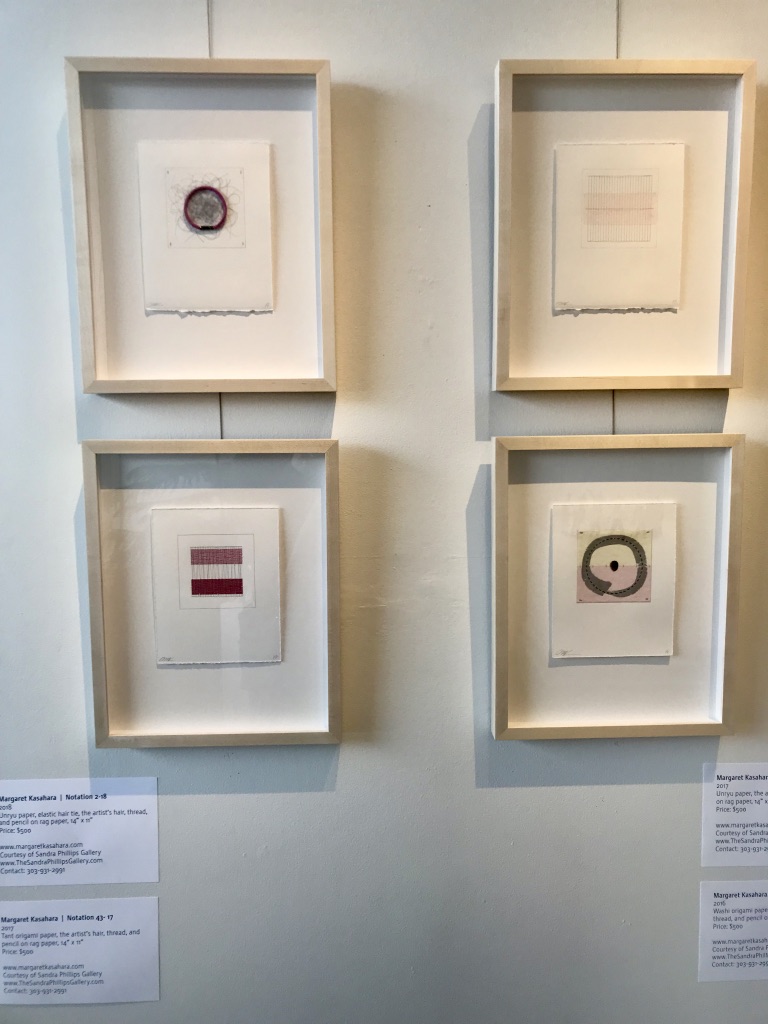
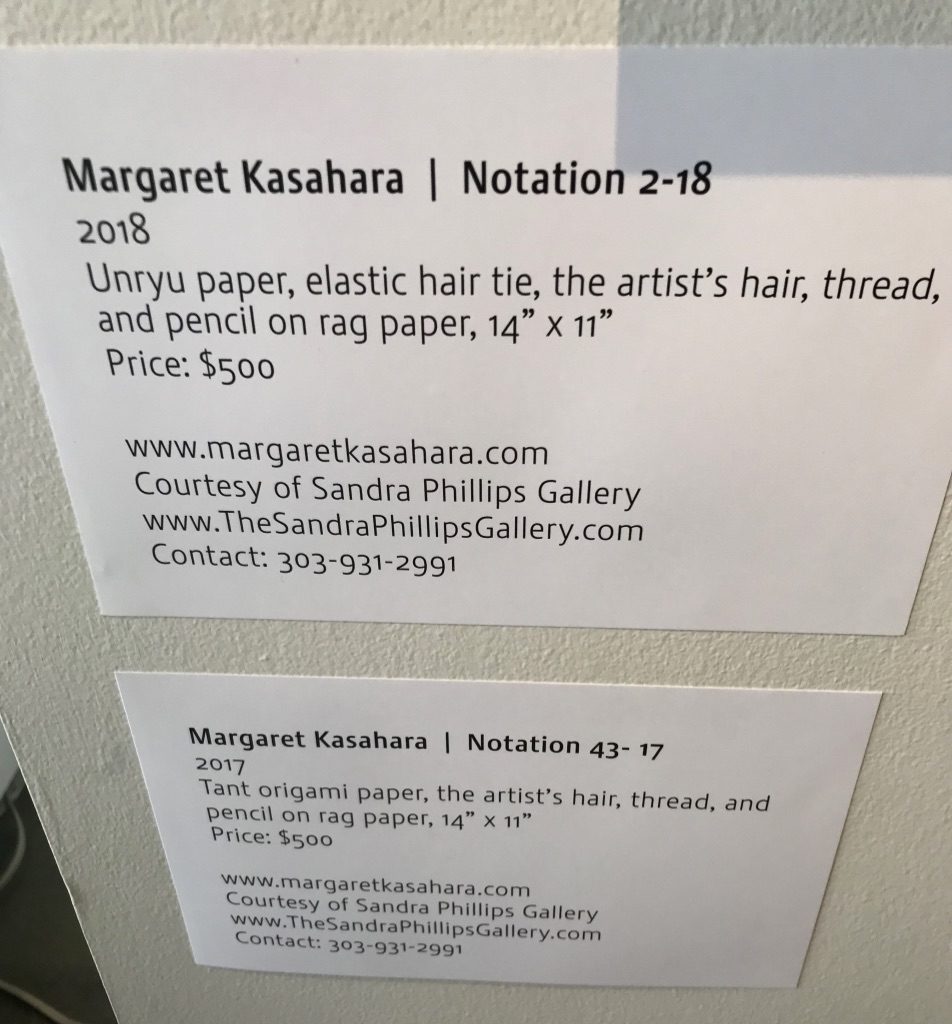
Installation of 4 works by Margaret Kasahara at the Boulder Public Library in 2018.
The Basics for Exhibition Labels Next to Your Art
Many art exhibitions open with a statement by the curator or artist. Those longer labels give context to what the viewer is about to see and are placed at the entry to the show.
Then there are individual labels next to each artwork.
Your art labels should include your name, object title, and media/support/technique—at a minimum.
A retrospective of your work should also include the dates.
In a one-person exhibition, your name need not be as prominent on labels and you might, instead, make the title larger and put it before your name.
When showing with other people, distinguishing between artists is more important and names should be first.
If there are multiple rooms in the exhibition and your show's title text doesn't appear anywhere near your works, you might need your name on every label.
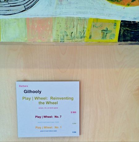
At 44T Gallery in Denver, they matched each label to the art for Barbara Gilhooly's exhibition. This label referenced 3 works in close proximity.
If your work is hanging at a restaurant where a customer could stare at it for longer periods of time, your name should be on every label.
If the exhibit is small or in a single room and there's a large sign with your name on it, you probably don't need your name on every label.
Size of Wall Labels for Your Art
The size of your labels depends on the size of the art, the size of the font you use, and the size of the crowd expected. Museums that expect huge crowds for blockbuster shows need larger labels so they can be read from farther away and over other people's heads.
But large labels tend to look silly next to small works, like Margaret Kasahara's in the image above. I love love love Margaret's work, but the labels seem to be as important as the work.
Labels used to be a lot smaller—think business-card-sized—until studies showed that they were hard to read. Make the font size at least 14 points. Larger is better when you want the majority of your audience to be able to read the labels.
No need for large margins around the text on a label. Crop it closely.
You can include more than one artwork on a label (as in the image to the right) as long as viewers can discern which information belongs with which piece.
1 Art Label, 3 Ways
Traditionally, titles of artworks are italicized. You could, instead, make them bold, all caps or larger than the other text. Distinguishing the titles is especially important if they give clues about the content of your work, such as the location of a landscape.
“Mixed media” isn't a medium. Using it is like saying something is a “painting” instead of “oil on linen” or “sculpture” instead of “bronze.” Spell out the various media you use within each mixed-media artwork. A curator is going to ask you that later anyway, so you might as well start treating your art like it's in a museum now.
Labels can be printed on cardstock and stuck on the wall with rolled masking tape or something like Elmer’s Tack removable adhesive putty. I don't recommend using the latter on textured walls because the adhesive gets caught in between the bumps.
For a more polished presentation print labels on regular paper, adhere the paper to mat board with spray glue, then cut out with a mat cutter.
Labels next to Margaret Kasahara's art at the Boulder Public Library in 2018. Margaret is now represented by Michael Warren Contemporary in Denver.
Labels within an exhibition should all be the same size unless there is need for longer, explanatory text.
Place object labels to the right if at all possible. Large sculpture may require that you place a label on the nearest wall or floor.
Hang all labels at the same height and use a level to make sure they are parallel to the floor.
Art Label Cheat Sheet
Viewers must be able to see your name when looking at your work.
People shouldn't have to guess what your work is made of.
The price, if for sale, should be clear.
Exhibition labels should be thoughtfully made. Any crooked sides or torn edges will detract from an appreciation of your work.
Above all, the labels should be consistent throughout the exhibition.
Your Art Exhibition Installation
Compose your art show just as you would a composition. Each aspect can contribute to the success of the show or make it seem less than impressive.
It begins with curating the work, but there is so much more that goes into a successful exhibition: preparation, installation, documentation, marketing, self-promotion, follow-up and more.
I’ve found that clear labels work the best. They look professional, adhere well, and can easily be moved and removed. They come in various sizes (I use the shipping label size (2″ x 4″ ).
Laurie: But don’t use them on textured walls. They look terrible! And they look bad when they start coming off from the wall, so work best with shorter exhibitions. I’ve seen clear labels that look really bad. Gotta keep tending to them.
Victoria Pendragon
Exceptionally useful advice…wish I’d had it last week! LOL
Hi Jennifer and Alyson,
Great advise on the labels. I always include the size of the painting. The reason being that some people think in numbers. They need to know how big a painting is to be able to envision it on the wall of their living room. Some customers don’t need that information at all.
Great tips for labels… I don’t know if your suggestion to put labels to the right covers this, but my preference is to put the labels at eye level beside the painting. I have shown with a number of artists who like the label below the painting and the price in a show guide. The argument is that it looks professional. My thought is “Why make people work so hard to learn about your work?”
Sandy: There’s all kinds of research on this. What is “eye level” for you might not be eye level for someone else. This document gives a wide range of 36-67″.
In the museum, we were very concerned with accessibility issues, so we placed them lower for people in wheelchairs. It’s an eye opener to go through your exhibit in a wheelchair!
John: Sure, that works, too. Be very careful that they don’t go to your home page or a sales page. They MUST go to juicy information that pulls people in.
I may be pessimistic, but I see QR codes as a waning fad. Whenever I use the QR codes at the museum, I notice I’m the only one doing so. Are you finding more positive results?
I’m about to use QRs at an exhibition. They each go to a blog post that shows the whole start-to-finish process of the piece of work. Might be successful, might not, I’m new to the whole business!
Alyson Stanfield
Love it, Suzanne. I’d like to know more!
Lynnda Tenpenny
I’ve struggled for years for the best way to do price labels for outdoor or indoor festivals. Everything in the booth is my work and my name is in several places, plus on the artwork, so name doesn’t seem necessary. Everything needs to go up fairly quickly and the artwork is slightly different each time. I’ve settled on using tags which I prepare in batches with a little swish of watercolors. I put the title and the price. Since I do Mixed Media, I very much like the idea of adding the “ingredients” of each artwork. Good topic!
Thanks for the tips, Alyson. Just wondering. Many of the galleries use numbers next to the work and then have a typed up list for the patrons to hold as they walk through the gallery, with the information regarding the painting next to the corresponding number.
What are your thoughts regarding this type of identification?
Wonderful advice as always! I’m starting to offer prints of certain paintings and am considering putting that information on my labels for my upcoming open studio event. Something like “Original $1500; Prints available”. Would you suggest also putting the price of the print on the label (or not mentioning them there at all)?
Awesome advice! I’ve had a couple of shows at odd venues (ie: in the lobby of a local independent old movie theater) that didn’t really have good places for business cards and the like. I decided to put QR codes on my tags that linked directly to the Etsy page of the painting.
To attach labels, I use Scotch Foam Mounting Squares, specifically the removable ones. They easy to use, strong, attach to nearly any surface, and come off quickly. http://www.amazon.com/dp/B004QMQ12E/
I actually use the Avery clean edge business cards for my labels: one side has all of the information about the artwork, the other is a business card. This gives a consistent size and format for the labels (you can set up templates just like for address labels), is easy to print and a breeze to detach – no cutting involved! Then when the work sells, the collector takes home the detailed information about my piece AND has a business card with all of my contact information. Another option is to use the self-print postcards if you need a larger size to fit more information, like a story about your artwork, or a mini-artist statement. The postcards don’t have as nice of finish/print quality as the business cards though.
Great tip about the Elmer’s poster tack – I will definitely be using this instead of scotch tape. Thanks!
Thanks for this info Alyson. I just saw a fabulous exhibit at The Portland Art Museum (Portland , OR) and the wall titles were semigloss letters adhered directly to the wall. It was beautiful and elegantly understated but very legible.
Does anyone know what material that is? How it was done? Thanks!
Hi, David. Yes, those are probably vinyl. Any sign store can print them for you.
Astrid Adler
Hello Alyson,
Thank you for your advice.
I volunteer as part of the hanging team for a gallery that has very limited funds. Today they had the data on business cards and affixed a piece of Scoth Brand clear tape folded over on itself in each corner of the card. I am convinced there has to be an equally inexpensive way to affix the cards to a wall.
I would most grateful for any suggestions you may have.
Warm regards,
Astrid Adler
Astrid: I can’t tell if you mean that they taped the artists’ business cards or they printed on something the size of a business card.
Either way, masking tape (rolled) on the back would look much better. We used masking tape to hang most of our signs in the museum!
Mechel Bell
For vinyl letters you could use a cricut machine.
And, I use gorilla brand sticky putty. It can be found at your local craft store in the craft/glue section. I then use a discount coupon that takes the price down to less than scotch tape.
I am thankful I found this site. It is reassuring to know I’m on the right track.
I am in a show this weekend where each artist hangs their own art. I am curious how the labels are going to look considering 5 different artists are each bringing their own.
That certainly is an issue, Mechel. Sounds like yours will stand out above the rest.
Beverly Banghart
I’m a brand new Artist, Started Sept. 2022. I would like to donate a 16in X 20in Acrylic on canvas to my Eye Dr. Is there anything specific I need to add?
DTaylor
I am director of a small community arts center with a beautiful little gallery space. We have a variety of artists showing in our space – some bring very nice looking labels and others arrive with sticky address labels that peel off very easily or just don’t work well in our space for whatever reason. Growing tired of this, I recently purchased plastic acrylic holders in standard business card size. Some are flat and we added velcro dots to hold them on our carpeted walls. Others are “L” shaped for use with 3D pieces on pedestals and in our display case. Artists can easily send me a spreadsheet with details in columns. Then I can do a mail merge to an avery template and print on avery business cards. It is perhaps a small improvement, but so wonderful to present a more polished look in our gallery.
Sounds perfect, D! You are in a position to instill professional practices in the artists you work with. I encourage you to use each opportunity to educate them.
Exactly was I was searching for. 🙂 I’m working on branding for an artist and this was really helpful for the vignette. The only thing that I’m not sure about, I don’t think I saw the size on which they should be printed on…
Hi, Isabelle. I’m happy this is helpful for you. The size kind of depends on the size of the audience and the size of the font. Let me update this right now.
Alyson Stanfield
Added, Isabelle! Unfortunately I can’t be exact, but I hope those extra guidelines are helpful. Thanks for asking.
Diane O
I agree about the “Mixed Media” description needing to be specific about materials used. My question is, how specific do you need to be? For example, I often use both watercolor pencils and watercolor from a palette. Do I have to spell that out or can I just say “watercolor”?
This is so helpful, thank you. Your site has become my “go to” for this kind of question.
I am starting to show some limited edition linocut prints.
My question is – would I put the specific number on the label (E.g. 9/13) or just say how large the edition is (E.g. Edition of 13)
I too really like the no-nonsense approach you offer in your guidelines. I wonder if you can recommend a label protector product – acrylic maybe. We are leasing artwork from a museum for long-term display in the public areas of a Hilton Hotel that will open soon. I need something durable that protects the card stock label that doesn’t look tacky.
Stephen: Yes! You can put acrylic over the labels. Just make sure it doesn’t have too much of a glare on it. You can also have fancier labels printed at print shops–on material that is more durable. Many museums use the paper on top of mat board approach, but they have guards in all of the rooms to make sure people aren’t mucking around with the labels. Good luck! And thanks for dropping in.
Rebecca Baillie
Hi there, please could you let me know what font you have used for these labels?
Best wishes
I’m not sure which labels you’re referring to, Rebecca, but the only ones I “made” were the digital examples of Arthur Jackson. And I did that so long ago (almost 20 years) that I can’t recall.
Sande Waters
what do you suggest for labelling artwork in a hospital setting? Do transparent labels work in a long term situation?
Sande: I would do the same label. You can use plexiglas or something else more durable for longer term—as long as the full credit is visible. Thanks for asking.
I’m creating the art labels for a small art gallery and I’m not sure what I should put on the label for materials for photographs. Would I describe the materials used for a photograph as “Ink and Paper”?
Marjorie: Many people these days just say “Digital photography” if that’s what it is. When hand printed, you’ll have a much wider array of medium: Gelatin Silver Print is a popular one, Color Inkjet Print, etc. Inkjet print on . See also: https://www.hkartadvisory.com/types-prints
Nancy
When framing digital photography, do you state the size of the print, or the framed size? Or both?
Nancy: If you’re talking about the labels, you would use the print size. But you could always use both, e.g. Print size 20×16, framed 24×20.
Largo
Hi Alyson,
I have 16 artworks at an exhibition. should each label have my name on it? the frames are 8×10, 3×2.5 too small for the label? thanks for your help in advance.
Largo: It depends. If they’re not on the label, would they see your name easily? (I like them on all of the labels.) Size of label also depends on how people will read them. The font size is more important than the label size. They need to be readable from a distance, but 8×10 means that people will probably have to get close to the art anyway. Good luck!
Yes! Please send the Comprehensive Exhibition Checklist + Timeline
You will also receive my almost-weekly news for your art business. You can unsubscribe at anytime. Privacy + Terms
Your Artist Mailing List: Rethinking + Assessing
Get a transcript of episode 182 of The Art Biz (Rethinking Mailing Lists for Artists) followed by a 3-page worksheet to evaluate the overall health and usage of the 3 types of artist lists.
Where can we send it?
To ensure delivery, please triple check your email address.
You’ll also receive my regular news for your art business.


58 thoughts on “Pointers on Wall Labels for Your Art Exhibition”
I’ve found that clear labels work the best. They look professional, adhere well, and can easily be moved and removed. They come in various sizes (I use the shipping label size (2″ x 4″ ).
Laurie: But don’t use them on textured walls. They look terrible! And they look bad when they start coming off from the wall, so work best with shorter exhibitions. I’ve seen clear labels that look really bad. Gotta keep tending to them.
Exceptionally useful advice…wish I’d had it last week! LOL
Sorry I’m late, Victoria. You’ll get ’em next time!
Just what the doctor ordered. Thanks Alyson!!
Yes, you have a bunch of exhibits coming up, don’t you Susan? Glad you found this helpful.
Great tips. Thank You 😊
Any thoughts about including the size of the painting on the label?
Jennifer: I don’t think that’s necessary since the artwork is right in front of the viewer.
Hi Jennifer and Alyson,
Great advise on the labels. I always include the size of the painting. The reason being that some people think in numbers. They need to know how big a painting is to be able to envision it on the wall of their living room. Some customers don’t need that information at all.
Question:
When should you NOT put a price on the label?
Col: When it’s not for sale, when it’s shown in a museum, or when the guidelines of the venue dictate.
Pingback: How to for labeling your art displays | Visual Artists Collective
Great tips for labels… I don’t know if your suggestion to put labels to the right covers this, but my preference is to put the labels at eye level beside the painting. I have shown with a number of artists who like the label below the painting and the price in a show guide. The argument is that it looks professional. My thought is “Why make people work so hard to learn about your work?”
Sandy: There’s all kinds of research on this. What is “eye level” for you might not be eye level for someone else.
This document gives a wide range of 36-67″.
In the museum, we were very concerned with accessibility issues, so we placed them lower for people in wheelchairs. It’s an eye opener to go through your exhibit in a wheelchair!
Thanks for providing this helpful info. I’ll try the color-full labels at my next art festival.
Great info! This is on my “to-do” list. Thanks!
How about including a small QR code with link back to your site/info?
John: Sure, that works, too. Be very careful that they don’t go to your home page or a sales page. They MUST go to juicy information that pulls people in.
I may be pessimistic, but I see QR codes as a waning fad. Whenever I use the QR codes at the museum, I notice I’m the only one doing so. Are you finding more positive results?
I’m about to use QRs at an exhibition. They each go to a blog post that shows the whole start-to-finish process of the piece of work. Might be successful, might not, I’m new to the whole business!
Love it, Suzanne. I’d like to know more!
I’ve struggled for years for the best way to do price labels for outdoor or indoor festivals. Everything in the booth is my work and my name is in several places, plus on the artwork, so name doesn’t seem necessary. Everything needs to go up fairly quickly and the artwork is slightly different each time. I’ve settled on using tags which I prepare in batches with a little swish of watercolors. I put the title and the price. Since I do Mixed Media, I very much like the idea of adding the “ingredients” of each artwork. Good topic!
Thanks for the tips, Alyson. Just wondering. Many of the galleries use numbers next to the work and then have a typed up list for the patrons to hold as they walk through the gallery, with the information regarding the painting next to the corresponding number.
What are your thoughts regarding this type of identification?
Wonderful advice as always! I’m starting to offer prints of certain paintings and am considering putting that information on my labels for my upcoming open studio event. Something like “Original $1500; Prints available”. Would you suggest also putting the price of the print on the label (or not mentioning them there at all)?
Awesome advice! I’ve had a couple of shows at odd venues (ie: in the lobby of a local independent old movie theater) that didn’t really have good places for business cards and the like. I decided to put QR codes on my tags that linked directly to the Etsy page of the painting.
To attach labels, I use Scotch Foam Mounting Squares, specifically the removable ones. They easy to use, strong, attach to nearly any surface, and come off quickly. http://www.amazon.com/dp/B004QMQ12E/
Love thia idea.
I actually use the Avery clean edge business cards for my labels: one side has all of the information about the artwork, the other is a business card. This gives a consistent size and format for the labels (you can set up templates just like for address labels), is easy to print and a breeze to detach – no cutting involved! Then when the work sells, the collector takes home the detailed information about my piece AND has a business card with all of my contact information. Another option is to use the self-print postcards if you need a larger size to fit more information, like a story about your artwork, or a mini-artist statement. The postcards don’t have as nice of finish/print quality as the business cards though.
Great tip about the Elmer’s poster tack – I will definitely be using this instead of scotch tape. Thanks!
Thanks for the tips. Very useful blog!
Thanks for this info Alyson. I just saw a fabulous exhibit at The Portland Art Museum (Portland , OR) and the wall titles were semigloss letters adhered directly to the wall. It was beautiful and elegantly understated but very legible.
Does anyone know what material that is? How it was done? Thanks!
Hi, David. Yes, those are probably vinyl. Any sign store can print them for you.
Hello Alyson,
Thank you for your advice.
I volunteer as part of the hanging team for a gallery that has very limited funds. Today they had the data on business cards and affixed a piece of Scoth Brand clear tape folded over on itself in each corner of the card. I am convinced there has to be an equally inexpensive way to affix the cards to a wall.
I would most grateful for any suggestions you may have.
Warm regards,
Astrid Adler
Astrid: I can’t tell if you mean that they taped the artists’ business cards or they printed on something the size of a business card.
Either way, masking tape (rolled) on the back would look much better. We used masking tape to hang most of our signs in the museum!
For vinyl letters you could use a cricut machine.
And, I use gorilla brand sticky putty. It can be found at your local craft store in the craft/glue section. I then use a discount coupon that takes the price down to less than scotch tape.
I am thankful I found this site. It is reassuring to know I’m on the right track.
I am in a show this weekend where each artist hangs their own art. I am curious how the labels are going to look considering 5 different artists are each bringing their own.
That certainly is an issue, Mechel. Sounds like yours will stand out above the rest.
I’m a brand new Artist, Started Sept. 2022. I would like to donate a 16in X 20in Acrylic on canvas to my Eye Dr. Is there anything specific I need to add?
I am director of a small community arts center with a beautiful little gallery space. We have a variety of artists showing in our space – some bring very nice looking labels and others arrive with sticky address labels that peel off very easily or just don’t work well in our space for whatever reason. Growing tired of this, I recently purchased plastic acrylic holders in standard business card size. Some are flat and we added velcro dots to hold them on our carpeted walls. Others are “L” shaped for use with 3D pieces on pedestals and in our display case. Artists can easily send me a spreadsheet with details in columns. Then I can do a mail merge to an avery template and print on avery business cards. It is perhaps a small improvement, but so wonderful to present a more polished look in our gallery.
Sounds perfect, D! You are in a position to instill professional practices in the artists you work with. I encourage you to use each opportunity to educate them.
Pingback: Exhibition preparation | KW Photography 3 – Sustaining Your Practice
Pingback: Part four – Resolving and promoting your publication – The exhibition context | KW Photography 3 – Sustaining Your Practice
Exactly was I was searching for. 🙂 I’m working on branding for an artist and this was really helpful for the vignette. The only thing that I’m not sure about, I don’t think I saw the size on which they should be printed on…
Hi, Isabelle. I’m happy this is helpful for you. The size kind of depends on the size of the audience and the size of the font. Let me update this right now.
Added, Isabelle! Unfortunately I can’t be exact, but I hope those extra guidelines are helpful. Thanks for asking.
I agree about the “Mixed Media” description needing to be specific about materials used. My question is, how specific do you need to be? For example, I often use both watercolor pencils and watercolor from a palette. Do I have to spell that out or can I just say “watercolor”?
The labels you link to aren’t foam. So do you use foam ones or the ones in the link?
This is so helpful, thank you. Your site has become my “go to” for this kind of question.
I am starting to show some limited edition linocut prints.
My question is – would I put the specific number on the label (E.g. 9/13) or just say how large the edition is (E.g. Edition of 13)
Many thanks!
Hi Alyson —
I too really like the no-nonsense approach you offer in your guidelines. I wonder if you can recommend a label protector product – acrylic maybe. We are leasing artwork from a museum for long-term display in the public areas of a Hilton Hotel that will open soon. I need something durable that protects the card stock label that doesn’t look tacky.
Thanks !
Stephen: Yes! You can put acrylic over the labels. Just make sure it doesn’t have too much of a glare on it. You can also have fancier labels printed at print shops–on material that is more durable. Many museums use the paper on top of mat board approach, but they have guards in all of the rooms to make sure people aren’t mucking around with the labels. Good luck! And thanks for dropping in.
Hi there, please could you let me know what font you have used for these labels?
Best wishes
I’m not sure which labels you’re referring to, Rebecca, but the only ones I “made” were the digital examples of Arthur Jackson. And I did that so long ago (almost 20 years) that I can’t recall.
what do you suggest for labelling artwork in a hospital setting? Do transparent labels work in a long term situation?
Sande: I would do the same label. You can use plexiglas or something else more durable for longer term—as long as the full credit is visible. Thanks for asking.
I’m creating the art labels for a small art gallery and I’m not sure what I should put on the label for materials for photographs. Would I describe the materials used for a photograph as “Ink and Paper”?
Marjorie: Many people these days just say “Digital photography” if that’s what it is. When hand printed, you’ll have a much wider array of medium: Gelatin Silver Print is a popular one, Color Inkjet Print, etc. Inkjet print on. See also: https://www.hkartadvisory.com/types-prints
When framing digital photography, do you state the size of the print, or the framed size? Or both?
Nancy: If you’re talking about the labels, you would use the print size. But you could always use both, e.g. Print size 20×16, framed 24×20.
Hi Alyson,
I have 16 artworks at an exhibition. should each label have my name on it? the frames are 8×10, 3×2.5 too small for the label? thanks for your help in advance.
Largo: It depends. If they’re not on the label, would they see your name easily? (I like them on all of the labels.) Size of label also depends on how people will read them. The font size is more important than the label size. They need to be readable from a distance, but 8×10 means that people will probably have to get close to the art anyway. Good luck!